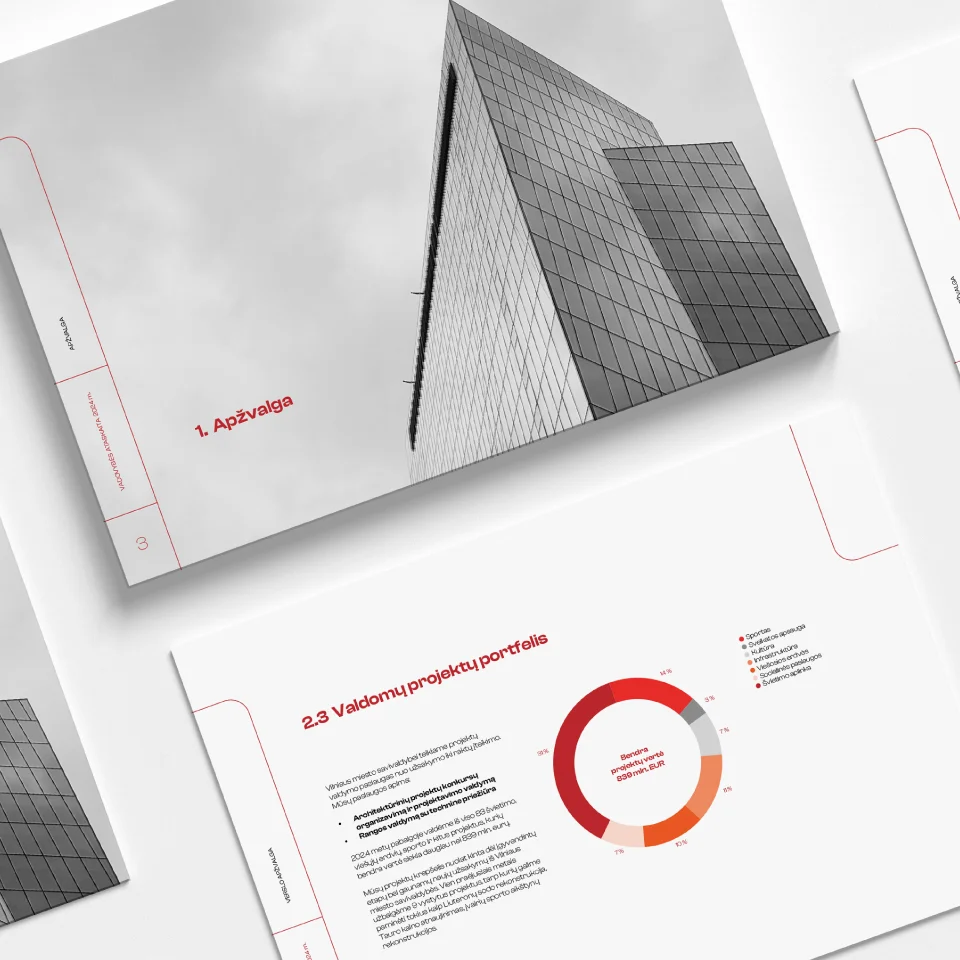
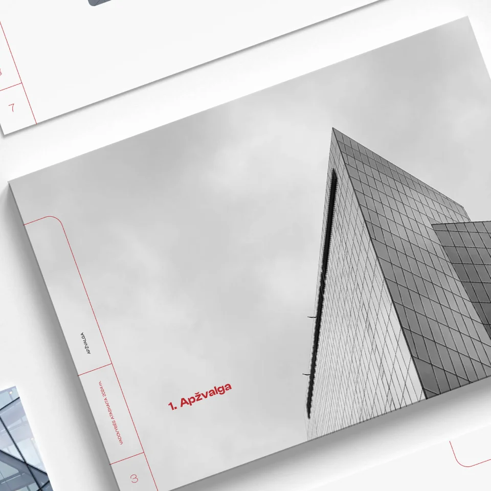
Linear graphics dominate the management report, creating a feeling of lightness, cleanliness, and freshness. When there is a large amount of information, avoiding heavy page design becomes essential. To enliven the visual, a fragment of a graphic element — a rounded square — was introduced. Its placement is not fixed; it interacts with empty space and shifts throughout the pages, adding a sense of dynamism without overshadowing photographs or textual information. To strengthen the sense of clarity and reflect the visual identity, red is used as an accent color, complemented by black and soft gray tones.