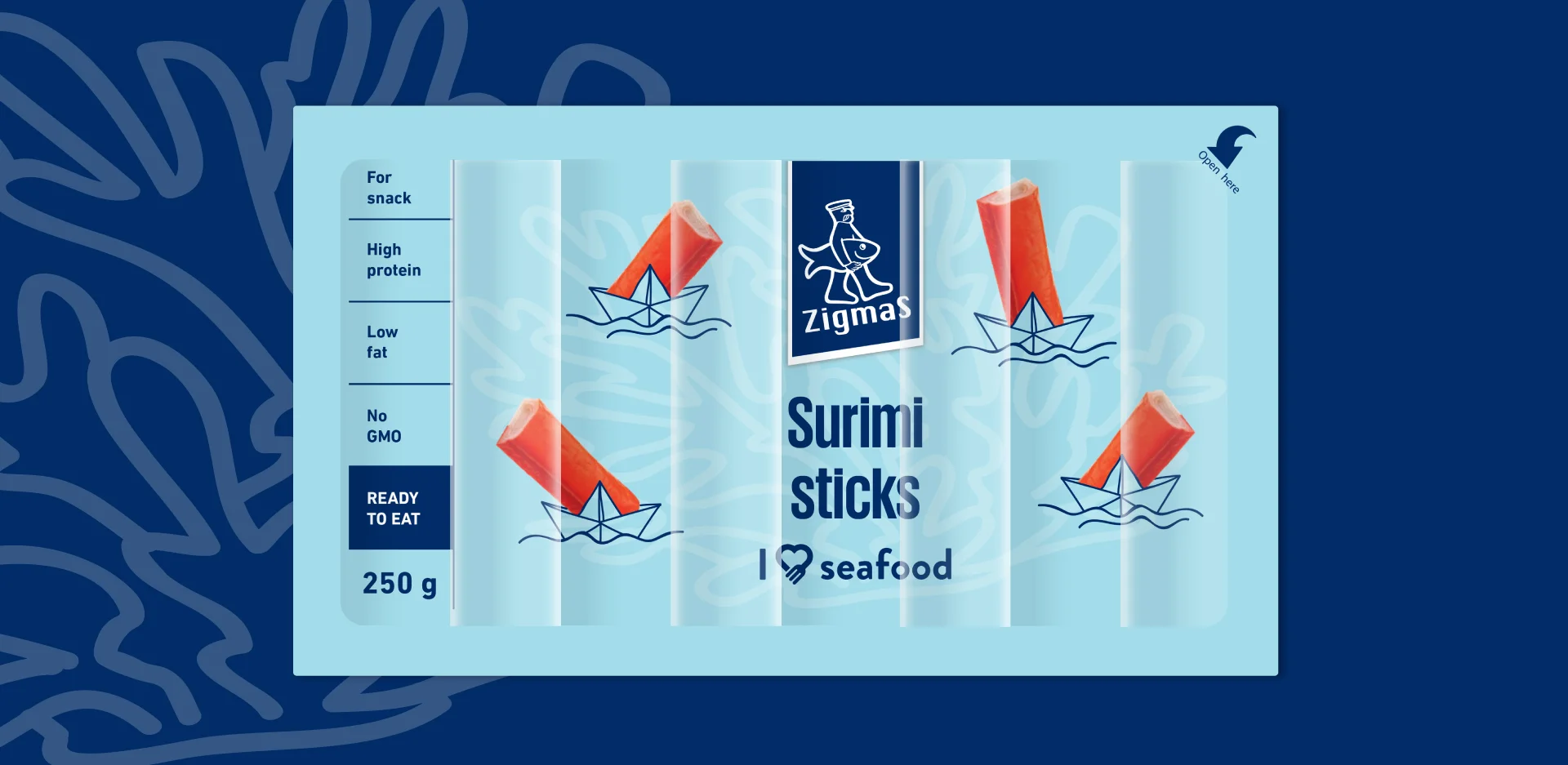
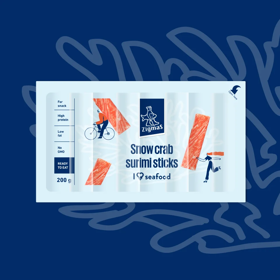
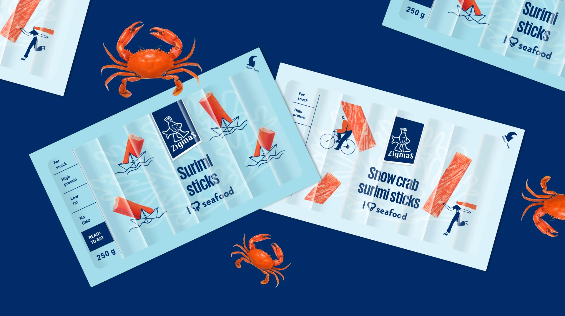
The goal was to refresh the packaging design and stand out in the category, therefore solutions rarely seen in the market were chosen — bright, distinctive colors, graphics, and various shapes. To emphasize the ready-to-eat idea as clearly as possible, one of the packages uses illustrated characters who rush / run / drive / hurry while carrying real surimi sticks with them. The visual style of real sticks continues in the second package, combining a maritime theme with the story of the sticks traveling by boat.